
NAEFS (North American Ensemble Forecasting System)
NAEFS is an initiative involving Canada, the United States and Mexico. NAEFS establish meteorological forecasts combining American and Canadian ensemble systems.
Introduction and Description of Ensemble Forecast
The Canadian Ensemble Prediction System
The Canadian Ensemble System is composed of 20 members and 1 control member. The 20 members are based on the Global Environmental Multi-Scale model (GEM). The 20 models don't have the same physical parameterization, assimilation cycle or perturbed observations. Fore more information on Ensemble Forecast system, click here.
The American Ensemble Prediction System
The American Ensemble System is composed of 20 members with 1 control. Each member represents a perturbed forecast. Perturbations come from independent breeding cycles. More details on this system are available at the following links:
Interpretation of the unified chart of temperature anomaly forecast: day 8 to 14 Outlooks.
This chart represents the probabilistic forecast of temperature anomaly over the NAEFS (or global) domain. On the same chart are depicted forecast probabilities for temperature anomaly to be above, near or below normal. In contrast to the individual charts for each category, only the 50% and higher probability values are enhanced (probabilities for the 2 other categories may have non zero value but they are below the 50% threshold). White areas are then representative of regions with probability values lower than 50%.
Information on the charts is explained on the following image. Click on the map to open it at full resolution to get the complete information on a region (the full probabilities value, for one or the other category), consult the individual charts for each of the 3 categories.

Interpretation of individual charts for the 3 categories of forecast temperature anomaly : day 8 to 14 Outlooks.
These charts represent the probabilistic forecast of temperature anomaly. They are available for both the NAEFS and the global domain for each of the 3 categories: above, near and below normal. Interpretation is the same for all of them, only the color enhancement is changing to indicate the category (above, near or below normal). The following image represents forecast probabilities for the temperature anomalies to be above normal (uncalibrated data). As opposed to the unified chart, the full range of probabilities is enhanced, from 0 to 100%. To get an example of probabilistic forecast interpretation, click on this link.
Information on the charts is explained on the following image. Click on the map to open it at full resolution.
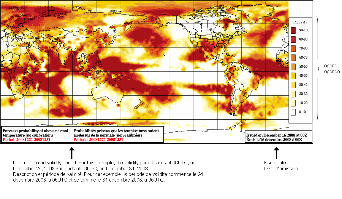
Chart samples (for the same date) for the other categories: Near normal and Below normal.
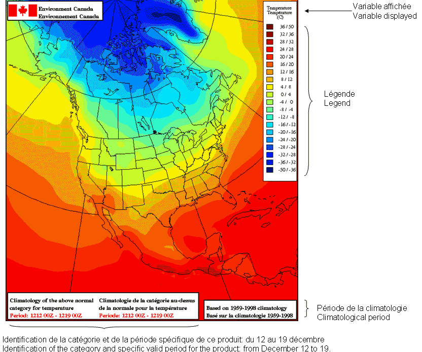
Temperature climatology charts: content and interpretation.
These charts help to determine the range of temperature values, for an above, near or below normal forecast of temperature anomaly. Related to the previous images (the NAEFS and Global coverage image) one can determine what the temperature is for a specific region.
As an example, take the Gaspe Peninsula, where, based on the NAEFS chart we have a probability value between 90 and 100% to have above temperature anomalies (90 to 100% of the ensemble members indicate above normal temperature anomaly). What would be the expected temperature values if the forecast is good?
On the climatological chart for temperature (below) we can see, for the Gaspe Peninsula temperature values ranging from -8 to -4 Celsius. Those are the temperature threshold values. If the forecast is good (above normal) then the temperature would be above (warmer) those values.
Information on the charts is explained on the following image. Click on the map to open it at full resolution.
- Date modified: